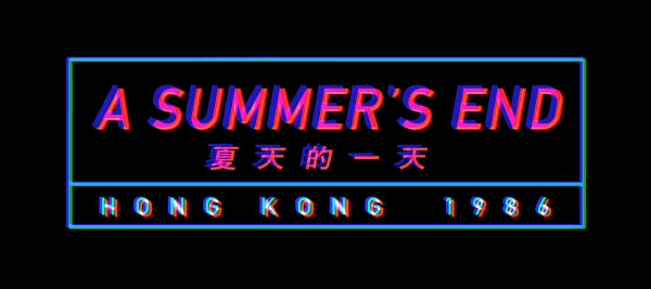
Set Design: Recreating 1980s Hong Kong
We found background design one of the most difficult parts of our game’s creation. Portraying Hong Kong in the 1980s in the game in an appropriate manner was something important for us. It was also quite a challenge.
We started the process by searching for references. We wanted to depict 1980s Hong Kong as accurately as we could. We gathered references from media, memory, and personal sources that would help us understand what Hong Kong was like in the 80s. We looked through old magazines and family photos. We asked for anecdotes from people that lived in Hong Kong during the 80s. We also made a trip to Hong Kong the previous year to study the location. Of course much has changed in the past 30 years, but our trip was useful in helping us design the overall mood and atmosphere of the setting we wished to create. We found 1980s Hong Kong movies as one of the best sources of visual reference for us.
Another challenge for set design was finding the right art style that would complement our character art. As accurately and authentically as we wanted to portray the location, the final product is a stylistic rendering of Hong Kong. In the early phase of design, we originally wanted to have a more simplistic style for the backgrounds. We wanted our backgrounds to have a limited and subdued colour palette as we wanted the mood and atmosphere to be the key feature in the background design. We found that it didn’t quite work with our character art. The characters stood out too much and the background became too bland in comparison. We kept reworking the designs until we were happy with the result.

Early bedroom design

Final bedroom design
Another stylistic decision one might notice in the game is the lack of crowds in the backgrounds. Hong Kong is a dense and highly populated city, and it should be expected that there would be people in public places. We found in our early designs that background characters distracted from the avatar art. Reproduction and consistency would have been another issue. It would have also been too difficult and laborious for our artist to consistently produce backgrounds of such complexity especially for the amount of backgrounds and locations we would feature in the game. There is a metaphorical element in our background design also.

Early metro station design

Final metro station design
Colour is a very important aspect of our set designs. The properties of colour (hue, saturation, and value) as well as the use of colours (complementary, analogous, triadic colours) was something we experimented and refined during our design process. Colour is a very powerful tool in helping us set the mood and atmosphere in the story. Colours help create associations with certain emotions. Colours can also be used to show transitions in mood. We applied these colour theories to our character designs as well.
We hope you look forward to the art in A Summer’s End! Many of the backgrounds are based from real locations in Hong Kong, so we hope that you will take delight in recognizing them in the game. We’re excited to explore Hong Kong with you as we have recreated in A Summer’s End soon!
If there’s any areas of interest anyone wishes for us to explore more of in our blog, please definitely reach out to us in our social media or in our contact page. We’re happy to share what we’ve learned. It has been a journey for us making this game and we hope what we have shared has been interesting to read.